
What Is Irlen Syndrome? Colored Overlays and Visual Stress
If reading leaves you with headaches, tired eyes, or words that seem to move, shimmer, or blur on the page, the problem may not be your eyesight at all. It may be visual stress — often linked to what’s known as Irlen syndrome. This guide explains what it is, how colored overlays help, and which colors and fonts tend to make reading easier.
What Irlen Syndrome Is
Irlen syndrome (also called Meares-Irlen syndrome or scotopic sensitivity) is a perceptual processing difficulty. The eyes and brain struggle to handle certain wavelengths of light — especially the high contrast of black text on bright white paper or screens. It is not a problem with the eyes themselves, which is why standard eye tests usually come back normal.
Common signs include:
- Words appearing to move, swirl, or double
- Glare or a “washed out” feeling from white pages and screens
- Headaches or eye strain after a short time reading
- Losing your place or skipping lines
- Reading more slowly and tiring quickly
It often overlaps with dyslexia, but the two are distinct: dyslexia affects how the brain decodes language, while Irlen syndrome affects how it processes visual information. A person can have one, both, or neither.
How Colored Overlays Help
For many people, placing a colored overlay or tint over the page — or tinting the screen — reduces the contrast and glare that trigger visual stress. The right color can make text sit still, sharpen, and become far more comfortable to read.
The effect is very individual. There’s no single “dyslexia color”; the helpful tint varies from person to person, which is why being able to try different colors matters.
What Color Overlay Helps With Dyslexia and Visual Stress?
Research and practice point to soft, muted tints rather than strong ones. Colors that people commonly find helpful include:
- Blue and turquoise — often reported to calm the page
- Yellow and cream — reduce the harsh white glare
- Rose, peach, and pink — gentle, warm contrast
- Green and grey — soft, low-glare options
The best approach is to test a few and notice which one makes the text feel steadiest and most comfortable — then adjust its strength. A tint that’s too dark can be as tiring as no tint at all.
Best Fonts for Dyslexia and Reading Comfort
Alongside color, the shape and spacing of text makes a real difference. To make reading easier:
- Choose sans-serif fonts such as Arial, Verdana, or dyslexia-specific typefaces
- Increase letter and line spacing so characters don’t crowd together
- Use a larger text size
- Avoid pure black on pure white — soften both
Trying It on Your Own Screen
Since so much reading now happens on phones and tablets, adjusting the screen itself is the most practical fix.
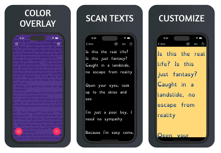
- Dyslexia Overlay adds a customizable colored tint over your whole screen, so you can dial in the exact color and strength that eases the glare — and use a line guide to track text.
- Dyslexia Reader lets you paste or open text and read it with dyslexia-friendly fonts, tinted backgrounds, and adjustable spacing and size.
Between them you can experiment with color, font, and spacing to find the combination that makes reading feel effortless.